This was not a very pleasant couple of weeks for POSH TUI project. I managed to merge like 5-6 lines of code change. But apart from that, completely blocked on all important issues.
Risky from start
POSH TUI is a public example of how not to do side projects. I currently have:
- Little production experience with GOLANG (previously I have written only a couple of small utilities)
- No experience with Bubbletea framework
- Never written such TUI apps before, just simple CLI apps
- No experience with elm architecture
However, I love https://charm.sh/.
I, personally, use their software and love it and many apps built with BubbleTea framework and love those too! POSH TUI documentation browser just had to be written with Bubbletea -- I never even considered alternatives. And community in charm is just so charming and warm!
While previously, I mentioned that my biggest issues are purely technical. I made quite significant mistakes while working on this version of app
I was racing to deliver something "workable", but completely overlooked the fact that UI is just garbage. And doesn't sparkle joy in any way!
Interface

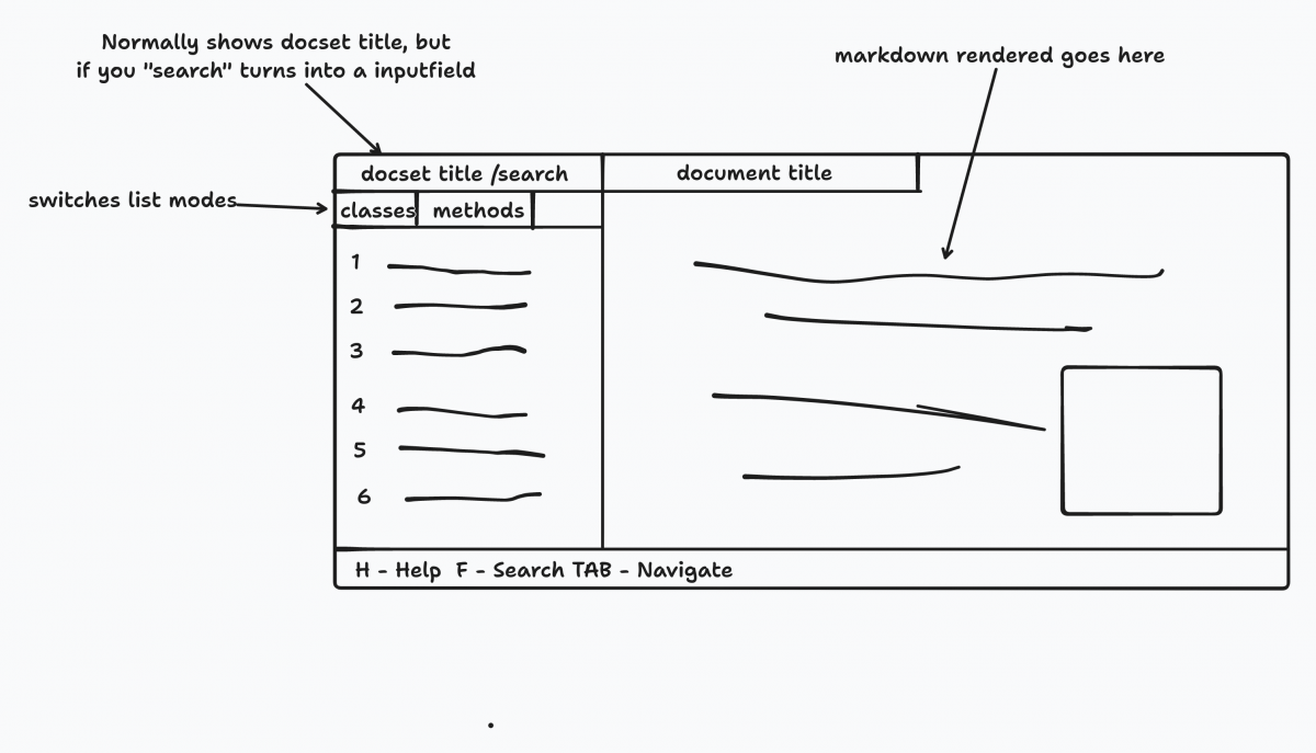
I haven't finished TUI layout, but already feel that there are plenty of missing things and direction seems wrong. I laid out my biggest complaints about existing version:
- Search is one of most important features, yeat it's not even noticeable on interface until you hit a certain shortcut
- Left list box is too small to fit all possible variety of class and method names. Also that list is usually too big, so I have to show a tiny (miniscule) subset of it. Making it wider or bigger is not an option.
- Entire interface doesn't scale well to big screens.
- And my biggest surprise, is that people hate TUI's with passion because those almost always lack mouse support, while having a complicated Ui structure that is hard to navigate. Adding mouse support should be trivial enough, though. I just never though that this could be important for a TUI app.
You can easily notice that my “interface wireframe” has a very close resemblance to Dash app (the app that started it all). It actually feels like a TUI version of app - a rip of in a way.
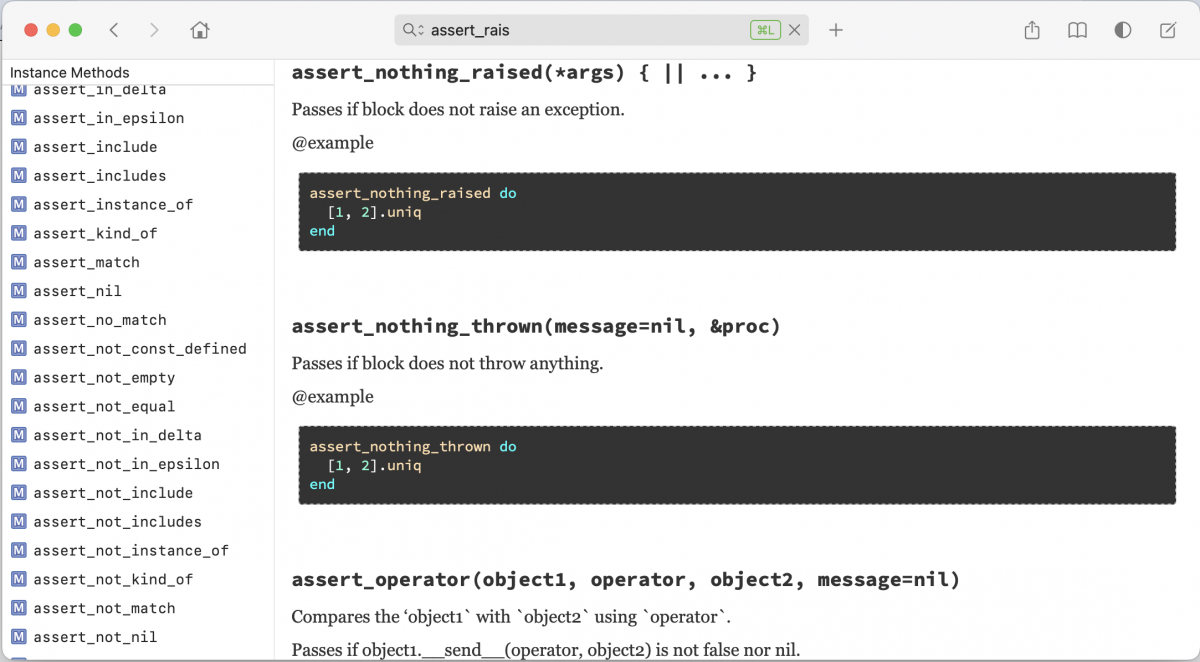
Another great inspiration was awesome "Nap" by talented Maas Lalani. Initially, I had many doubts, if I should try to mimic "dash" app as a TUI, but Nap proved to me that it's possible and could look great.
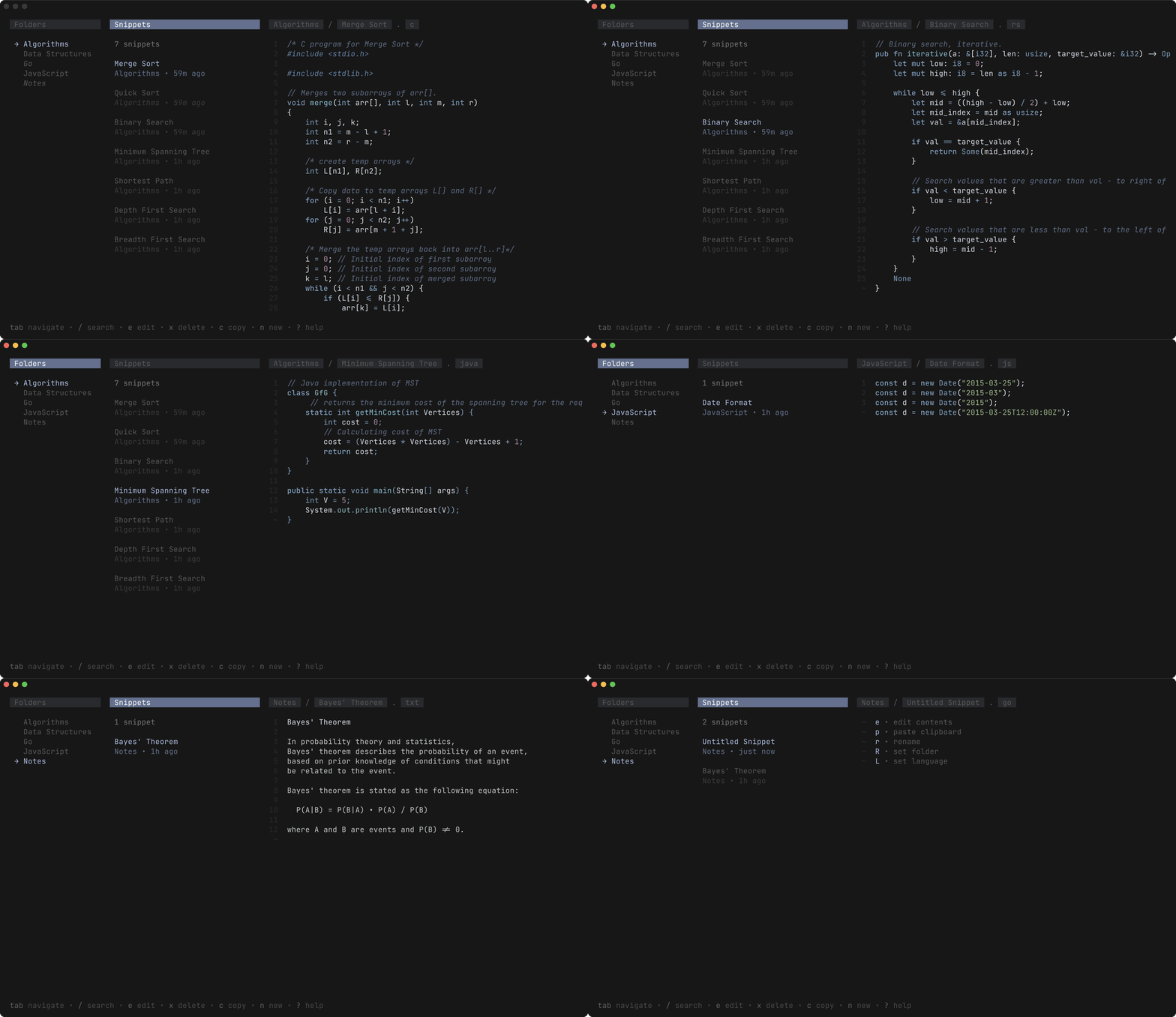
But this aesthetic doesn't fit this project.
Back to the drawing board
With deeper understanding of BubbleTea and how TUI apps are built and function under the hood. It's time to scrap it all and start all over. I will, of course, have a lot of code I already have, but UI needs a revamp.
I'm guessing something along the lines of "sunbeam" app.
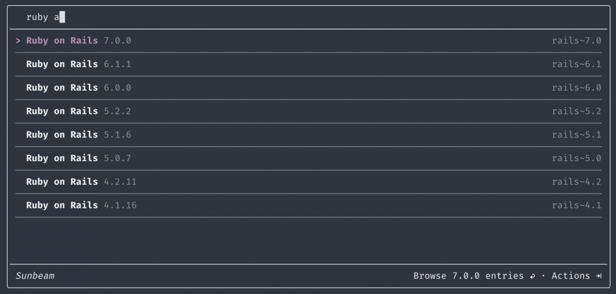
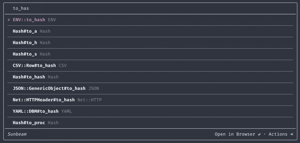
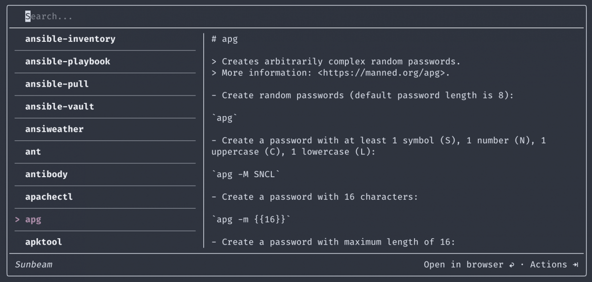
This time, I'll build a UI prototype first and will use mocked data for that. Once prototype is in a right place, usable and convenient, I'll move on to finish all the functional parts.
I will, off course, will be sharing everything along the way...
See you after two weeks, with another update.
